
Sometimes in this line of work someone gives you a job that is nothing but fun.
Visual Jazz was rebuilding the entire Baker’s Delight website, and as a bit of a side project we were given the task of building a virtual bakery in Flash. The bakery was to be a high gloss virtual representation of one of their stores, allowing visitors to browse through a sample selection of their products.
It was a simple project with a pretty cool looking result. Read on to find out some of the features, and then check it out at http://www.bakersdelight.com.au/virtual.html.
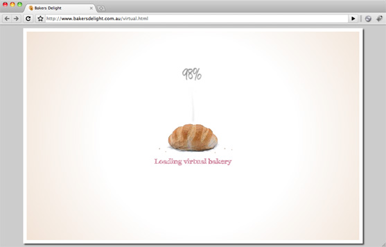
Going through in a chronological order, the site starts off with a steaming loaf of bread. The loading progress of the site is spelled out in the steam coming off of the bread. This neat little trick was created using DisplacementMap filters in Flash. It was a pretty simple trick, once I learned out displacement maps actually worked.
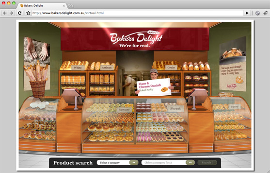
After that, the user is presented with the store front. All of the different categories are laid out on display in the store. The store was set up such a way that it panned and distorted based on mouse movement, giving the slight feeling that you were looking around a store. It is a very subtle effect, but took some careful cutting out of graphics to make it work without looking like a room made of rubber.
A staff member is situated in the store holding up different promotional signs. These signs can be easily swapped out for different promotions, and linked to any external pages required.
As an extra subtle little thing – if you look closely at the counter you will see that it reflects the mouse along its curved surface. This again was created via the use of displacement maps.
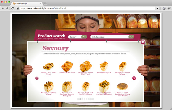
When the user clicks on a category, the camera zooms in on the staff member, who holds up a board displaying all of the products. The products are displayed in a traditional paged grid system. Nothing too fancy going on here – but it does look pretty clean.
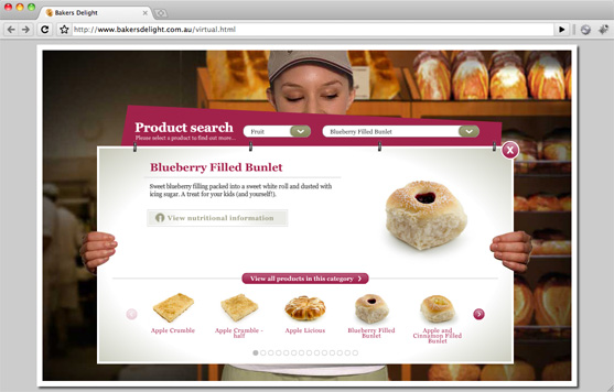
When a product is selected, the grid collapses down to a single line so that the details of the product can be displayed. This looks like a simple enough effect, but getting this grid to figure out how it should collapse and expand proved to be one of the most difficult tasks on this site.
The detail view of the product displayed the usual information you would expect. The cool, and possibly over the top, part of this page was that some of the products were shot in a 360 degree fashion, allowing the user to spin/rotate the product around so it could be seen from any side.
That about sums it up. I love it when I get to work on projects like this 🙂
Source : www.tugaskita.com