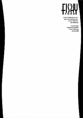
They Fishy Food corporate identity was created as part of a typographical experiment. The actual company does not exist (to the best of my knowledge).

The first step was to create the logo. It was to be mostly typographical and had to work in both colour and monochrome.
After exploring many different font shapes and styles this final font was settled chosen because of the way the ‘s’ shape lent itself to the shape of a fish.
Many different colour combinations were also explored for the logo before the simple black, white and red approach was selected.
The next step was to apply this design to a range of stationery. This included business cards, letter head and a mock-up of a menu.


