
Did you ever get the feeling that you were being tested? That’s what happened to me with this site. The designers I work with at Visual Jazz really like to push us developers some times.
When I first saw the designs for it I remember saying to myself ‘Gosh darn! How is one supposed to go about doing that??’ (I may have used some more colourful language but you get the gist) I had never done 3D before, and that was just the beginning. There was depth of field, keyed out video, and a pile of information to be displayed.
Luckily, it all came together in the end – you can read about how in this post.
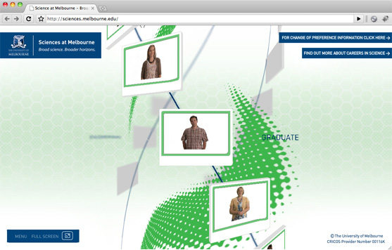
The main idea behind the site was for a big 3D column with 3 spiralling streams of video screens wrapped around it. The user could spin and pan the column around to see the different screens. When they click on one, it would come to the foreground where a video would then play.
The first place I started was to learn about PaperVision 3D. Luckily for me, there is a huge number of posts and tutorials to get me started. Yay for the internet!
Once I had the customary 3D primitives floating around on screen, I started looking into the problem of faking depth of field. The idea I had was to create a series of blurred textures for each object, then swap them out based on their distance from the camera. If you want a bit more detail on this, check out an post I wrote on it here.
There were of course some other tricky items involved – because the screens have some depth to them, simply blurring the textures did not look right. I had to make it so that when the screens got about halfway back, they were swapped over with a basic plane.
The next 3D problem was the curved lines. We could have just had some curved lines modelled up in max, but because we wanted the lines to blur, they had to be done in a similar way to the other blurry objects. I ended up coming up with a bit of code that would generate the curved lines from a series of small straight lines, basically aligning them from end to end. This allowed me to blur individual segments, which wasn’t a perfect result, but worked pretty damn well.
I can’t even remember the exact method – I just know that it included a fair bit of trigonometry and experimentation.
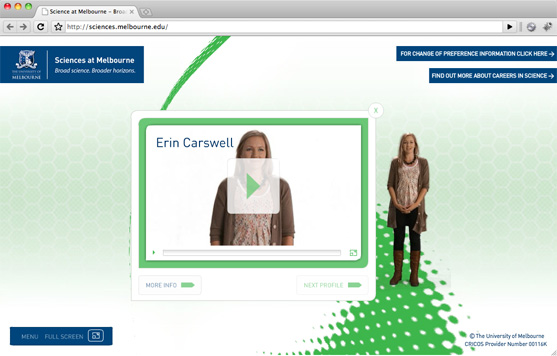
The last 3D part was getting the videos to line up with the 3D screens when they were selected. It took a bit of playing around, but after a bit of googling and tweaking some figures I finally got it all lining up nicely. There is bit of a formula to getting 3D graphics to line up, but once you know it, it just works.
Oh, as for the big green curved shapes, they were pretty simple. They were simplymodelled up by the 3D guys and loaded into the scene via a Collada (DAE) file. Apart from some minor texture path issues, they were probably the easiest parts of the site.
The videos themselves were pretty cool. Each of the students represented on a screen was filmed on a keyed background, walking out from behind the panel. They would then introduce themselves before returning back to behind the panel. It was a pretty simple trick, but proved to be quite effective. There was a little bit of trickery involved getting the walking in and out to look right, but we got there in the end.

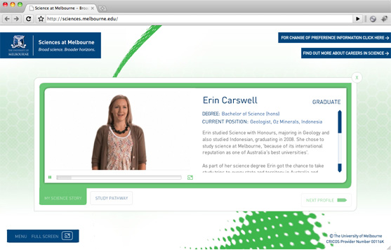
After all of that, the only remaining content was a series of different informational pages. These were pretty straightforward and were achieved by using a template system that was run off of XML based content. This allowed us to easily add and edit content to the site without the need for an entire rebuild.
Overall it was a pretty cool project, so check it out if you get the chance – Sciences at Melbourne. You can also read about it on the Visual Jazz site.